Bauhaus
Typography
Project
TYPOGRAPHY
This Bauhaus typography project is based upon two fonts, Joschmi and Xants, of which I describe in detail further below.
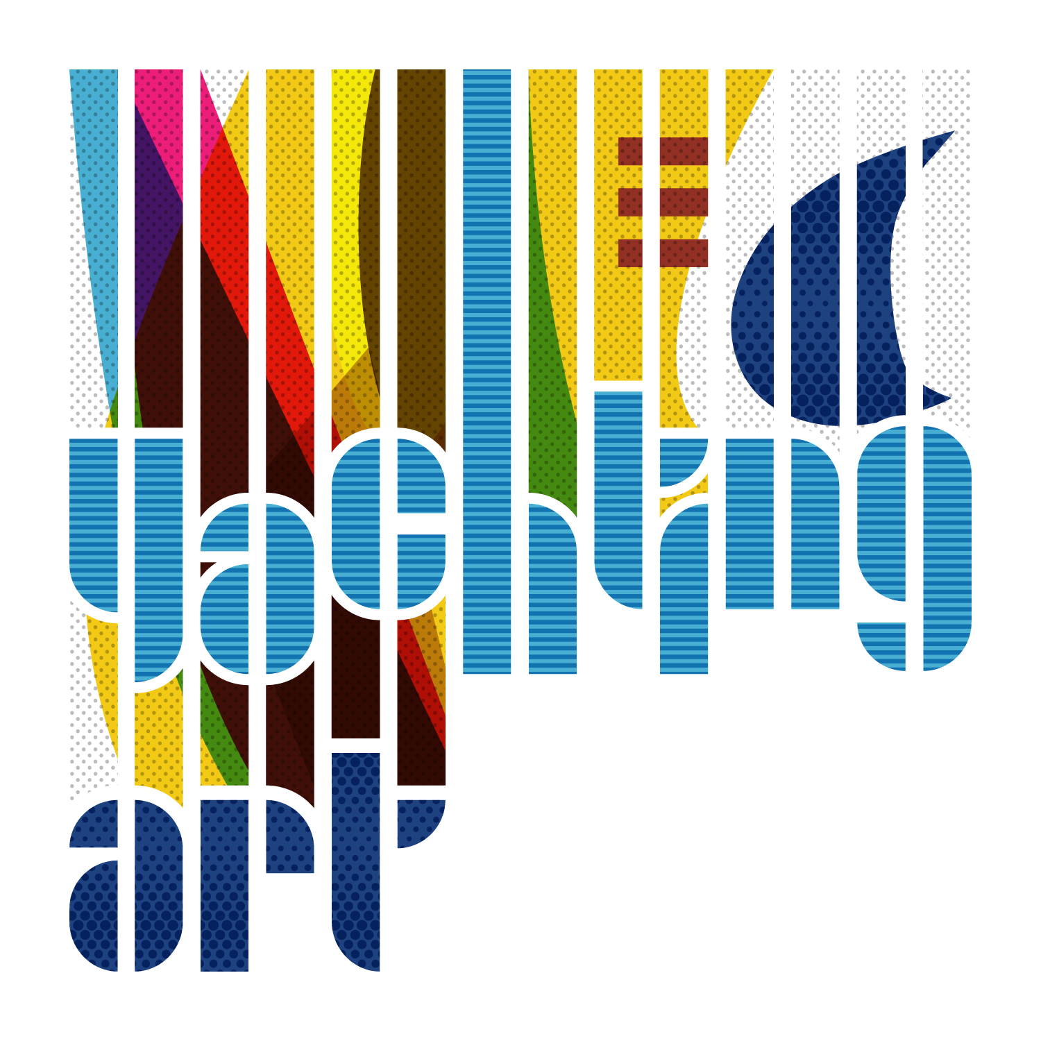
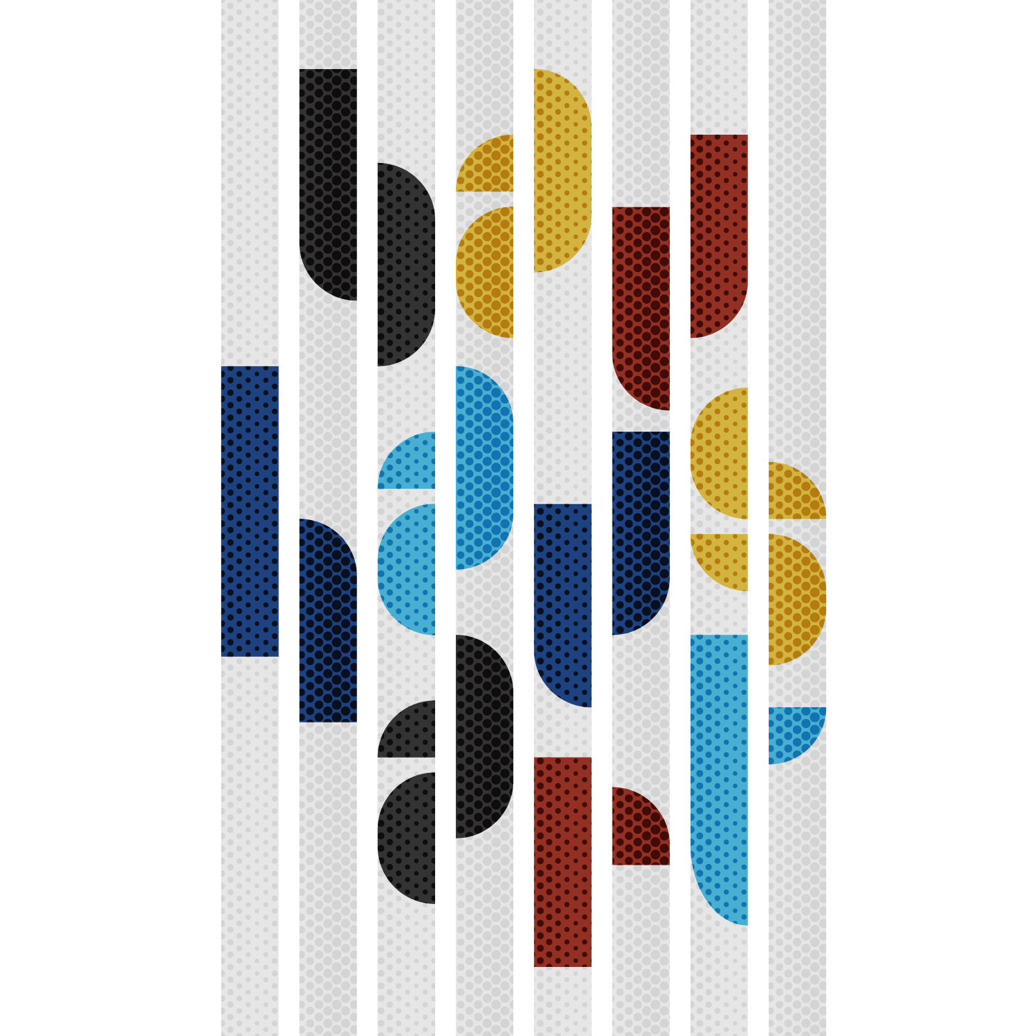
Composing with the typical geometric patterns, forms, and overlaps of the Bauhaus style, I integrated the fonts Joschmi and Xants into dynamic typographic designs.
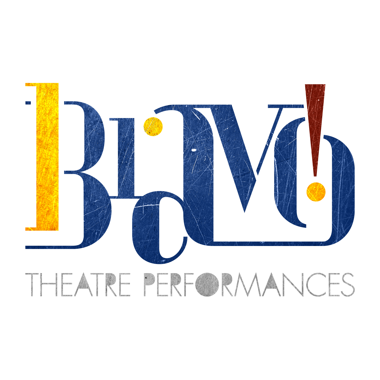
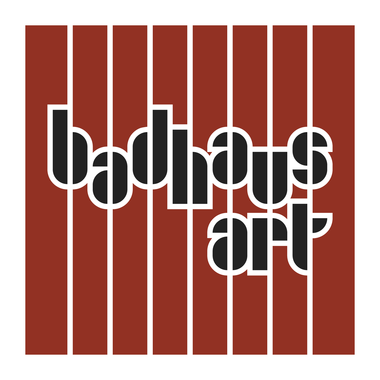
The typographic studies explore the different qualities of the fonts, such as the vertical slices inherent in Joschmi, and place fictive logos in varying contexts, from a satiric commentary on the temptation of taking one’s self too seriously (BADHAUS) to a logo design for a theatre company based on the Xants font (BRAVO!).
The Fugue & Lux logo mix the Joschmi and Xants fonts to create a header logo for a magazine covering Home, Garden, Travel and Leisure topics focused on luxury items and services.
Joschmi
Re-created by: Flavia Zimbardi
Joost Schmidt
Creator of the now-famous poster for the 1923 Bauhaus Exhibition in Weimar, Germany, Schmidt taught calligraphy and directed the advertising, typography, and printing workshop at the Bauhaus school of design in Dessau. More than any other master or student, he shaped the graphic design style we identify with the Bauhaus today.
Xants
Re-created by: Luca Pellegrini
Xanti Schawinsky
A multi-talented painter, photographer, architect, graphic designer, saxophonist, and stage designer, Schawinsky taught classes in set design. After leaving Bauhaus Dessau, he worked as a graphic designer in Italy, creating iconic artwork for major brands such as Cinzano, Motta, Illy, and Olivetti.
All images © 2023 Rodolphe Charpentier. All Rights Reserved


All content © 2023 Rodolphe Charpentier. All Rights Reserved.